
What is Exploratory Data Analysis?
Exploratory Data Analysis (EDA), also known as Data Exploration, is a step in the Data Analysis Process, where a number of techniques are used to better understand the dataset being used.
‘Understanding the dataset’ can refer to a number of things including but not limited to…
- Extracting important variables and leaving behind useless variables
- Identifying outliers, missing values, or human error
- Understanding the relationship(s), or lack of, between variables
- Ultimately, maximizing your insights of a dataset and minimizing potential error that may occur later in the process
Here’s why this is important.
Have you heard of the phrase, “garbage in, garbage out”?
With EDA, it’s more like, “garbage in, perform EDA, possibly garbage out.”
By conducting EDA, you cant urn an almost useable dataset into a completely useable dataset. I’m not saying that EDA can magically make any dataset clean — that is not true. However, many EDA techniques can remedy some common problems that are present in every dataset.
Exploratory Data Analysis does two main things:
1. It helps clean up a dataset.
2. It gives you a better understanding of the variables and the relationships between them.
Components of EDA
To me, there are main components of exploring data:
- Understanding your variables
- Cleaning your dataset
- Analyzing relationships between variables
In this article, we’ll take a look at the first two components.
1. Understanding Your Variables
You don’t know what you don’t know. And if you don’t know what you don’t know, then how are you supposed to know whether your insights make sense or not? You won’t.
To give an example, I was exploring data provided by the NFL (data here) to see if I could discover any insights regarding variables that increase the likelihood of injury. One insight that I got was that Linebackers accumulated more than eight times as many injuries as Tight Ends. However, I had no idea what the difference between a Linebacker and a Tight End was, and because of this, I didn’t know if my insights made sense or not. Sure, I can Google what the differences between the two are, but I won’t always be able to rely on Google! Now you can see why understanding your data is so important. Let’s see how we can do this in practice.
As an example, I used the same dataset that I used to create my first Random Forest model, the Used Car Dataset here. First, I imported all of the libraries that I knew I’d need for my analysis and conducted some preliminary analyses.
#Import Libraries
import numpy as np
import pandas as pd
import matplotlib.pylab as plt
import seaborn as sns#Understanding my variables
df.shape
df.head()
df.columns
.shape returns the number of rows by the number of columns for my dataset. My output was (525839, 22), meaning the dataset has 525839 rows and 22 columns.
.head() returns the first 5 rows of my dataset. This is useful if you want to see some example values for each variable.
.columns returns the name of all of your columns in the dataset.

df.columns output
Once I knew all of the variables in the dataset, I wanted to get a better understanding of the different values for each variable.
df.nunique(axis=0)
df.describe().apply(lambda s: s.apply(lambda x: format(x, 'f')))
.nunique(axis=0) returns the number of unique values for each variable.
.describe() summarizes the count, mean, standard deviation, min, and max for numeric variables. The code that follows this simply formats each row to the regular format and suppresses scientific notation (see here).
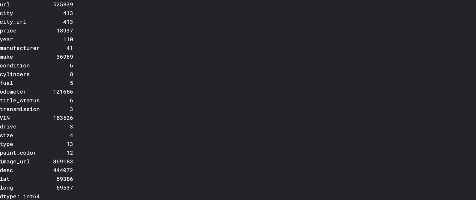
df.nunique(axis=0) output
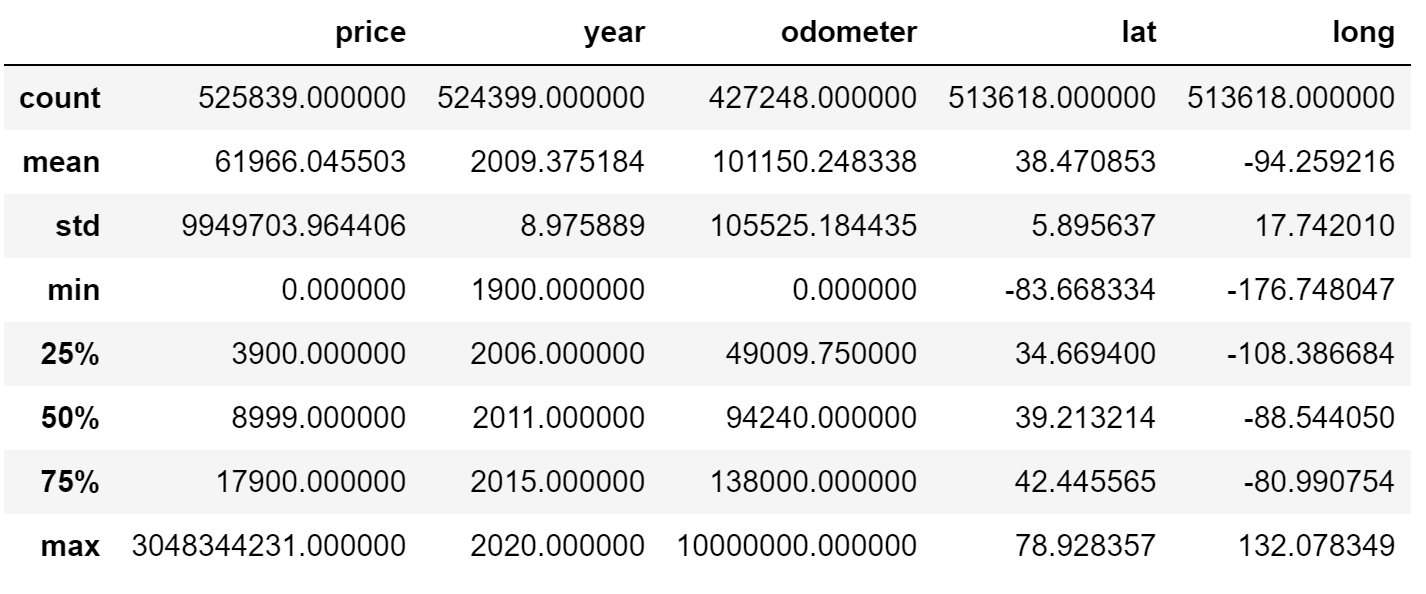
df.describe().apply(lambda s: s.apply(lambda x: format(x, ‘f’))) output
Immediately, I noticed an issue with price, year, and odometer. For example, the minimum and maximum price are $0.00 and $3,048,344,231.00 respectively. You’ll see how I dealt with this in the next section. I still wanted to get a better understanding of my discrete variables.
df.condition.unique()
Using .unique(), I took a look at my discrete variables, including ‘condition’.

df.condition.unique()
You can see that there are many synonyms of each other, like ‘excellent’ and ‘like new’. While this isn’t the greatest example, there will be some instances where it‘s ideal to clump together different words. For example, if you were analyzing weather patterns, you may want to reclassify ‘cloudy’, ‘grey’, ‘cloudy with a chance of rain’, and ‘mostly cloudy’ simply as ‘cloudy’.
Later you’ll see that I end up omitting this column due to having too many null values, but if you wanted to re-classify the condition values, you could use the code below:
# Reclassify condition column
def clean_condition(row):

    good = ['good','fair']
    excellent = ['excellent','like new']

    if row.condition in good:
        return 'good'
    if row.condition in excellent:
        return 'excellent'
    return row.condition# Clean dataframe
def clean_df(playlist):
    df_cleaned = df.copy()
    df_cleaned['condition'] = df_cleaned.apply(lambda row: clean_condition(row), axis=1)
    return df_cleaned# Get df with reclassfied 'condition' column
df_cleaned = clean_df(df)print(df_cleaned.condition.unique())
And you can see that the values have been re-classified below.
![]()
print(df_cleaned.condition.unique()) output
2. Cleaning your dataset
You now know how to reclassify discrete data if needed, but there are a number of things that still need to be looked at.
a. Removing Redundant variables
First I got rid of variables that I thought were redundant. This includes url, image_url, and city_url.
df_cleaned = df_cleaned.copy().drop(['url','image_url','city_url'], axis=1)
b. Variable Selection
Next, I wanted to get rid of any columns that had too many null values. Thanks to my friend, Richie, I used the following code to remove any columns that had 40% or more of its data as null values. Depending on the situation, I may want to increase or decrease the threshold. The remaining columns are shown below.
NA_val = df_cleaned.isna().sum()def na_filter(na, threshold = .4): #only select variables that passees the threshold
    col_pass = []
    for i in na.keys():
        if na[i]/df_cleaned.shape[0]<threshold:
            col_pass.append(i)
    return col_passdf_cleaned = df_cleaned[na_filter(NA_val)]
df_cleaned.columns

c. Removing Outliers
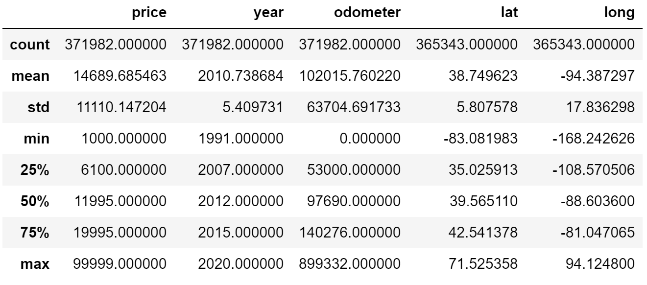
Revisiting the issue previously addressed, I set parameters for price, year, and odometer to remove any values outside of the set boundaries. In this case, I used my intuition to determine parameters — I’m sure there are methods to determine the optimal boundaries, but I haven’t looked into it yet!
df_cleaned = df_cleaned[df_cleaned['price'].between(999.99, 99999.00)]
df_cleaned = df_cleaned[df_cleaned['year'] > 1990]
df_cleaned = df_cleaned[df_cleaned['odometer'] < 899999.00]df_cleaned.describe().apply(lambda s: s.apply(lambda x: format(x, 'f')))
You can see that the minimum and maximum values have changed in the results below.
d. Removing Rows with Null Values
Lastly, I used .dropna(axis=0) to remove any rows with null values. After the code below, I went from 371982 to 208765 rows.
df_cleaned = df_cleaned.dropna(axis=0)
df_cleaned.shape
3. Analyzing relationships between variables
Correlation Matrix
The first thing I like to do when analyzing my variables is visualizing it through a correlation matrix because it’s the fastest way to develop a general understanding of all of my variables. To review, correlation is a measurement that describes the relationship between two variables — if you want to learn more about it, you can check out my statistics cheat sheet here.) Thus, a correlation matrix is a table that shows the correlation coefficients between many variables. I used sns.heatmap() to plot a correlation matrix of all of the variables in the used car dataset.
# calculate correlation matrix
corr = df_cleaned.corr()# plot the heatmap
sns.heatmap(corr, xticklabels=corr.columns, yticklabels=corr.columns, annot=True, cmap=sns.diverging_palette(220, 20, as_cmap=True))
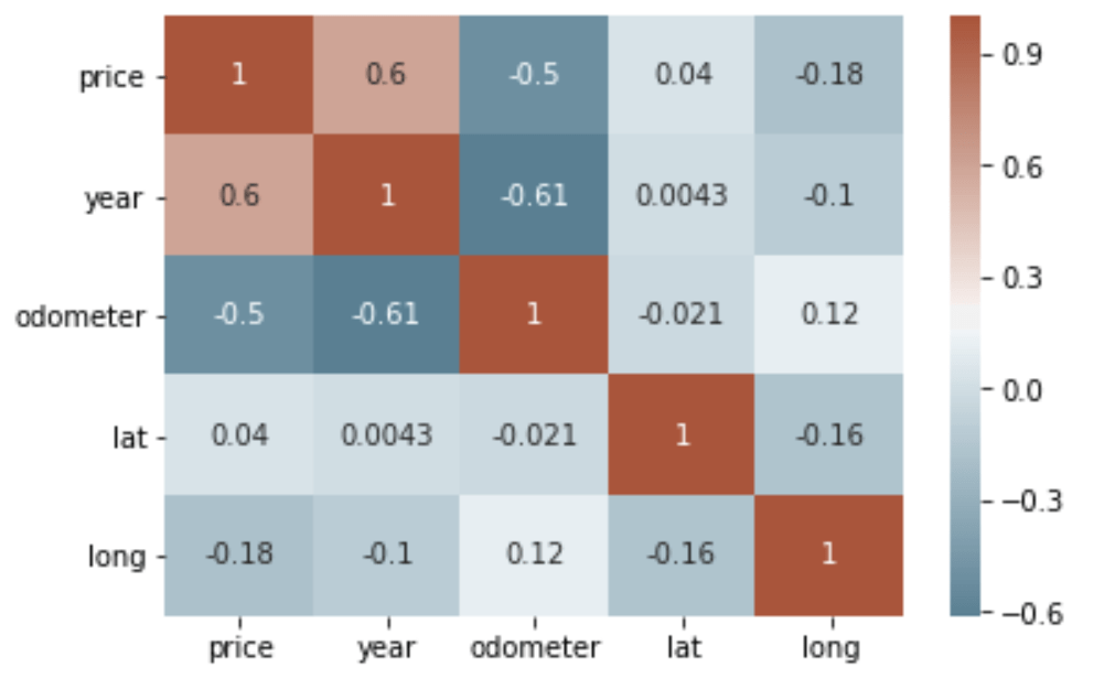
We can see that there is a positive correlation between price and year and a negative correlation between price and odometer. This makes sense as newer cars are generally more expensive, and cars with more mileage are relatively cheaper. We can also see that there is a negative correlation between year and odometer — the newer a car the less number of miles on the car.
Scatterplot
It’s pretty hard to beat correlation heatmaps when it comes to data visualizations, but scatterplots are arguably one of the most useful visualizations when it comes to data.
A scatterplot is a type of graph which ‘plots’ the values of two variables along two axes, like age and height. Scatterplots are useful for many reasons: like correlation matrices, it allows you to quickly understand a relationship between two variables, it’s useful for identifying outliers, and it’s instrumental when polynomial multiple regression models (which we’ll get to in the next article). I used .plot() and set the ‘kind’ of graph as scatter. I also set the x-axis to ‘odometer’ and y-axis as ‘price’, since we want to see how different levels of mileage affects price.
df_cleaned.plot(kind='scatter', x='odometer', y='price')
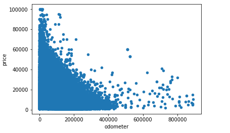
This narrates the same story as a correlation matrix — there’s a negative correlation between odometer and price. What’s neat about scatterplots is that it communicates more information than just that. Another insight that you can assume is that mileage has a diminishing effect on price. In other words, the amount of mileage that a car accumulates early in its life impacts price much more than later on when a car is older. You can see this as the plots show a steep drop at first, but becomes less steep as more mileage is added. This is why people say that it’s not a good investment to buy a brand new car!
df_cleaned.plot(kind='scatter', x='year', y='price')
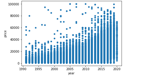
To give another example, the scatterplot above shows the relationship between year and price — the newer the car is, the more expensive it’s likely to be.
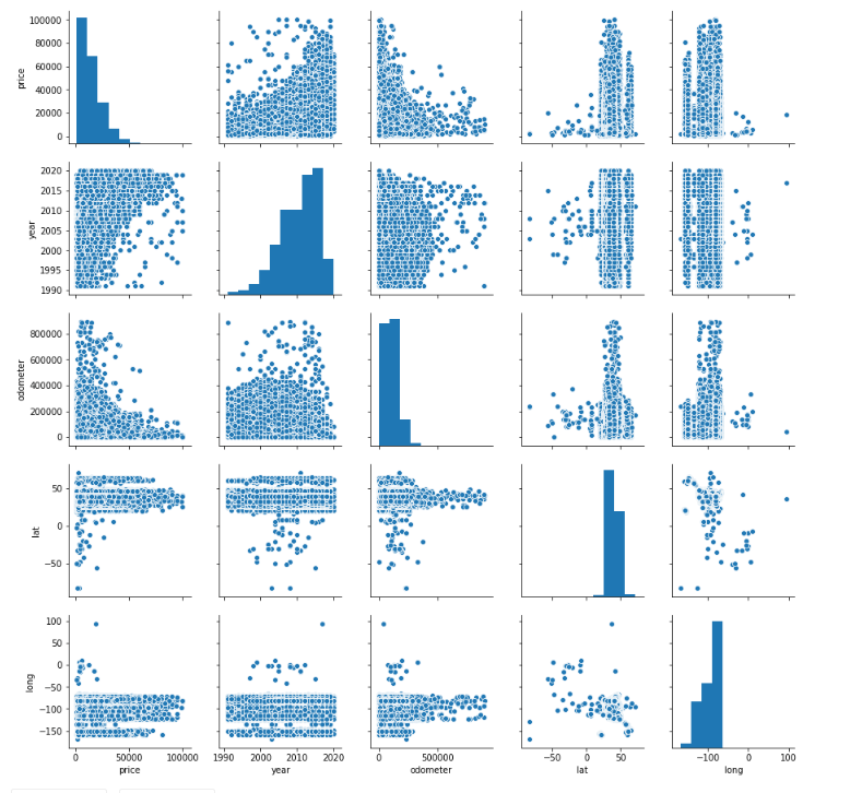
As a bonus, sns.pairplot() is a great way to create scatterplots between all of your variables.
sns.pairplot(df_cleaned)
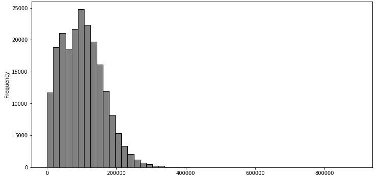
Histogram
Correlation matrices and scatterplots are useful for exploring the relationship between two variables. But what if you only wanted to explore a single variable by itself? This is when histograms come into play. Histograms look like bar graphs but they show the distribution of a variable’s set of values.
df_cleaned['odometer'].plot(kind='hist', bins=50, figsize=(12,6), facecolor='grey',edgecolor='black')df_cleaned['year'].plot(kind='hist', bins=20, figsize=(12,6), facecolor='grey',edgecolor='black')
df_cleaned['year'].plot(kind='hist', bins=20, figsize=(12,6), facecolor='grey',edgecolor='black')
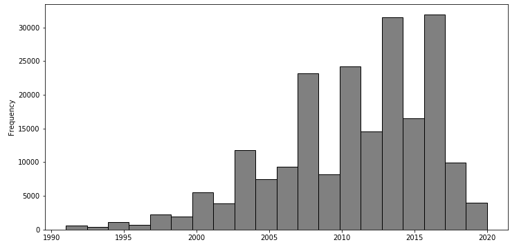
We can quickly notice that the average car has an odometer from 0 to just over 200,000 km and a year of around 2000 to 2020. The difference between the two graphs is that the distribution of ‘odometer’ is positively skewed while the distribution of ‘year’ is negatively skewed. Skewness is important, especially in areas like finance, because a lot of models assume that all variables are normally distributed, which typically isn’t the case.
Boxplot
Another way to visualize the distribution of a variable is a boxplot. We’re going to look at ‘price’ this time as an example.
df_cleaned.boxplot('price')
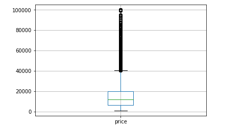
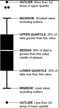
Boxplots are not as intuitive as the other graphs shown above, but it communicates a lot of information in its own way. The image below explains how to read a boxplot. Immediately, you can see that there are a number of outliers for price in the upper range and that most of the prices fall between 0 and $40,000.
There are several other types of visualizations that weren’t covered that you can use depending on the dataset like stacked bar graphs, area plots, violin plots, and even geospatial visuals.
By going through the three steps of exploratory data analysis, you’ll have a much better understanding of your data, which will make it easier to choose your model, your attributes, and refine it overall.
For more articles like this one, check out https://datatron.com/blog
Thanks for Reading!
Here at Datatron, we offer a platform to govern and manage all of your Machine Learning, Artificial Intelligence, and Data Science Models in Production. Additionally, we help you automate, optimize, and accelerate your ML models to ensure they are running smoothly and efficiently in production — To learn more about our services be sure to Book a Demo.